Showing posts with label packaging. Show all posts

Tuesday, October 25, 2011

Ben and Slayde get married

Our friends Ben and Slayde are getting married and our mutual friend has brewed up four different beers for the occasion. As if that weren't enough to be excited about, Ben designed these great labels for the beers. Each one depicts Ben and Slayde in a place that they've spend a considerable amount of time in and what they remember about that place most.

First up is the Oregon Hipster IPA. Yup, "I liked            before it was cool" sounds about right.  


Then we have the Virigina Road Rage Altbier. Anyone that has spent anytime in or around Fairfax County in the past 15 years knows what this is all about.


The DC Impossibly Expensive Dubbel. Ben and Slayde live out in Vienna and commute each morning to Georgetown. Enough said.


Last but not least is the Alaska Biting Insect Amber. I've never been to Alaska so I'll have to take their word for it.


What these lack in commercial appeal, they make up for in taste. Trust me.


Friday, October 7, 2011

Friday in the Harris Teeter

I just got our of the grocery and snapped a couple of iPhone photos. 

I was going to pick up a 6 pack of Spaten but I noticed the price went up by a dollar (it's been $6.99 for like at least a year.) Anyways, the geniuses in the marketing department wanted to raise the price but make it look like they were lowering it so they did this. Good thing I'm so stingy. Otherwise, I might have fallen for it. 


Then there was this. I'm having a hard time figuring out how the good folks at Kraft figured out that people want to buy frozen pizza and frozen cookies in the same box. I guess people like doughy baked things. Maybe when the two are packaged together people feel less guilty about eating frozen pizza and then moving right onto cookies. These people also brought you the Marlboro Red. Just sayin'


Tuesday, December 21, 2010

Bring back some simple packaging

I'm getting older and need a little less flash and a little more honesty. Look, I still like Nutella and I'm still going to need Windex. Just make it a little easier on me. The folks at A2591 have worked on  a project to strip down some common labels to their bare essence. I'm posting a few down here for you. Wouldn't you feel better if the supermarket where more like this?


Thanks to The Fox is Black

Thursday, November 11, 2010

Put this by the checkout,

and I don't care with the price tag is. You are telling me about hand crushed rosemary tea infusions with white chocolate and the packaged has watercolor and says "smile" at the bottom. It's going in cart. I don't even like chocolate.


via Lost in E Minor

Friday, November 5, 2010

Would you try it in this package?

I think it's pretty well established that Kimchi is a little daunting for the uninitiated but delicious for the initiated. The question remains, how does one cross over? Mother in Law Kimchi is here to help. I love the name but I love the packaging even more. Doesn't this just look safe to eat? It's almost like the yuppie salsa that Pace spent so much time warning you about some years ago. I'd try it, but I already like the stuff.


via Lost in E Minor

Tuesday, October 5, 2010

Just Love the Details


New Balance has this special MK1500 coming out. They seem to have internalized some of the really important things that you need to generate the most amount of buzz around a sneaker in the Fall of 2010. I'll list them for you-


Amazing packaging is the first thing. It's great to have a nice sneaker but if you are really going to covet it, should come in a nice box so you can look at in your closet every morning and feel just a little better about yourself.

A limited run is the second thing. This has been street tested by Nike time and time again. I think 50 pairs is a little extreme. But hey, who am I to say they are doing it wrong when I'm the one feeding the hype machine.

Made in the U.K. This is my new thing and it's one of the reasons I'm set on checking for New Balance in the future. 30% of New Balance sneakers are still made in the states and the U.K made models always look great too.

A classic colorway (in grey.) Grey sneakers are what up in the Fall of 2010. The plainer the better and sneaker companies have been holding out on us. Most of the grey colorways are coming out these limited runs and driving sneakerheads crazy.

A collaboration with a streetwear shop. I'm not sure what the value ad is here but it seems to be an important piece of the puzzle.

And there you have it. A flossy pair of kicks.

via Kicks on Fire

Tuesday, September 28, 2010

Just a Little Bit More Juice Please

Does this package make you want some juice? If you answered yes you are correct. It's a design for a fictional company by an Aussie design student named Yunyeen Yang. I'm looking forward to the moment that this is no longer a concept and actually something I pick up at the grocery store and pay for with my hard earned legal tender.


via Lost in E Minor

Wednesday, August 25, 2010

Kaws X Dos Equis

Dos Equis teamed up with graffiti artist gone super famous Kaws for special beer bottle. There is bad news and good news. The bad news is that it's only slated for a Mexican release. The good news is that they made a video.

Tuesday, August 17, 2010

Nice Packaging Never Hurt

This is not really what we think of when we think packaging or point of sale but it is clever packaging. South African airline Kulula has gone all out with inspired designs on one its planes. Flying 101 was created internally by the company in order to demystify airplane travel. After all airplanes are made with science and not with magic as magnets are made.


Wednesday, April 14, 2010

Puma rolls out new eco-packaging

When I was growing up, compact discs came in these tall cardboard boxes that were half-empty. It was years before anyone had the bright idea of just shrink wrapping the cd case and calling it a day. Puma just did a very similar thing with the shoe box. To be fair, I've seen shoes sold in bags before. It's still significant that such a large company with a global supply chain has taken a serious move to be more green while really improving the look and feel of it's packaging.

Wednesday, April 7, 2010

Speaking of chocolate packaging


Good lord. This is amazing. The chocolate is a hand-made by La Molina, which is an Italian company. The crafty aesthetic of these packages is pretty convincing that the product is hand-made and unique. The company's website is in both Italian and English so perhaps you can find this stateside.

Monday, March 29, 2010

Really good chocolate packaging


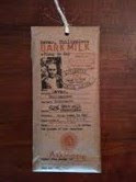
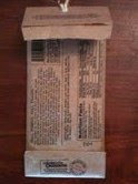
My sister recently bought me this bar of chocolate and wouldn't shut up about how much she loved the packaging. She was in the chocolate store and the store manager was ready to tell her all about how sustainable the product was and how the chocolate manufacturer really took care of the farmers. She didn't care though, she was just convinced that it was good by all the brown paper and the stamps. It wasn't a cheap bar of chocolate either.

It is cool packaging because it doest two things-

It makes you feel warm and fuzzy about the source of the product. It's got a photo of the head farmer and claims to be responsible in the treatment of the farmers themselves.

The combination of the brown paper and the type also make the chocolate appear to have been manufactured at the source. I'd rather eat chocolate made from a single cocoa source in West Africa than chocolate made from various cocoa sources and then shipped across the Atlantic to be manufactured.

This packaging gives me both those feelings and that is why is sells for $8 a bar.

I do think this brings up a good question. We, as progressive consumers in a wealthy society, have become aware of the huge income disparity between ourselves and the people that actually tend to the crops that produce the coffee and chocolate we enjoy. Labels like Fair Trade enhance our experience of eating the product and raise our willingness to pay. Why is it that we don't see similar packaging on other consumer goods such as apparel?

It's no secret that many consumers want to avoid buying clothing made in sweatshops. and many apparel companies have taken great strides to be more responsible in the regard. A few have even bought their own factories to ensure that working conditions are legit. Why doesn't the packaging of apparel reflect the steps that manufacturers have taken to ensure that no one was exploiting in the making of the product. I think there is a missed opportunity for companies that have taken the steps to treat the laborers in plants responsible to brag about it at the point of sale.

Wednesday, March 3, 2010

More eco-packaging


I recently came across Ecologic Brands which makes eco-friendly consumer packaging. On display here is an ingenious milk package that is partially made of recycled materials, partially compostable, partially recyclable and uses much less material than the average milk container.


Adoption of the product appears to be limited at the moment but I expect that to change with the quickness. It's my understanding that supply for organic milk will catch up with the boom in demand as dairies adjust. At this point organic milk distributors will be seeking an additional point of differentiation because just being organic won't be enough.

That is why this packaging is the future. It is a great fit with the organic milk market. It gives consumers an opportunity to be less wasteful, which is what most people really want. Hopefully, it can achieve good economies of scale.

Please check out Ecologic Brands website and Twitter feed.

Tuesday, March 2, 2010

Iced tea for kids

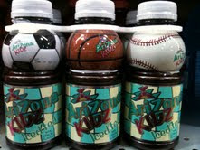
Some cool packaging caught my eye yesterday in the grocery store. I saw these colorful little plastic bottles with soccer balls and baseballs built into the top of them and thought, “Wow this is a good way to bond with kids.” then I noticed that the product was Arizona Iced Tea. Iced Tea for kids? I guess so. The label indicated that it was made with real black tea.

I have mixed feelings about Arizona selling iced tea to kids. It is a little too reminiscent of the way RJ Reynolds created a cartoon camel to reach kids and build lifetime customers. On the other hand, iced tea is not tobacco by any stretch of the imagination. It’s not even as bad for you as soda is and plenty of people give that to kids all the time. However, it still begs the question of if kids really do need caffeine in the first place. I will leave that for the experts. Either way, I’m willing to bet the packaging is successful at reaching kids and perhaps even developing long-term relationships with them.


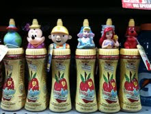
I was also feeling this other little bit of similar packaging that is just for juice. Who knew that Clifford was still popular with kids?